Table of contents
A lot of good developers I know cannot even create a simple responsive navbar from scratch. Now in the world of libraries such as React, developers are totally dependent on the prebuilt UI components that can be easily installed in your apps. This can serve to be a great choice, but this does not work in the long run. You should have the knowledge of the basics of HTML, CSS & JS before moving on to using libraries and frameworks for your projects.
Let's start creating our Navbar from scratch 🚀
Writing HTML for the Navbar
In this section, we will define the structure for our Navbar using HTML.
 <nav>
    <div class="logo">
      <img src="/images/Logo.png">
    </div>
    <input hidden type="checkbox" id="nav-checkbox">
    <label for="nav-checkbox">
      <img src="/images/hamburger.svg">
    </label>
    <div class="nav-items">
      <a href="#">Home</a>
      <a href="#">Service</a>
      <a href="#">Feature</a>
      <a href="#">Product</a>
      <a href="#">Testimonial</a>
      <a href="#">FAQs</a>
    </div>
    <div class="nav-btns">
      <a href="#" class="rounded-none">Login</a>
      <a href="#">Register</a>
    </div>
  </nav>
Let's summarize the HTML for our Navbar:
Create a
navtag to wrap all of our contentThe Navbar consists of a logo, links, 2 buttons, and an input with its label for toggling our dropdown in the mobile view
Writing CSS for the Navbar
Now, we will design our Navbar using basic CSS.
body {
     margin: 0;
     padding: 0;
 }

 nav {
     display: flex;
     justify-content: space-between;
     align-items: center;
     padding: 16px;
     position: relative;
 }

 .nav-items {
     display: flex;
     gap: 15px;
 }

 .nav-btns {
     display: flex;
     gap: 15px;
 }

 nav label {
     display: none;
 }
We have successfully designed our Navbar for larger screens(>768px). Now, we need to focus on making it responsive i.e. suitable for all kinds of screens. For that, we will have to write media queries 😍
@media only screen and (max-width: 768px) {
     .nav-items {
         position: absolute;
         flex-direction: column;
         right: 10px;
         top: 50px;
         background-color: rgb(247, 247, 247);
         padding: 20px;
         border-radius: 10px;
         display: none;
     }

     .nav-btns {
         display: none;
     }

     nav label {
         display: block;
         cursor: pointer;
     }

     input[type=checkbox]:checked~.nav-items {
         display: flex;
     }
 }
Let me summarize this section for you:
First of all, we're using
@media only screen and (max-width: 768px)to design for screens smaller than 768px. To understand media queries in CSS, please refer to this article: https://css-tricks.com/a-complete-guide-to-css-media-queries/Element with class
nav-itemswill serve as our dropdown, hence we have given itposition: absoluteandflex-direction: column. We don't want to show our dropdown when a user opens the website, hence we have provided adisplay: noneto it. To understand the concept of flex and position in CSS, you can refer the following articles: https://css-tricks.com/snippets/css/a-guide-to-flexbox/ and https://www.freecodecamp.org/news/css-positioning-position-absolute-and-relative/ respectively.input[type=checkbox]:checked~.nav-items { display: flex; }Here we will set the display property for the class
nav-itemsto flex if the input has the state checked. In this way, we just created a toggle button for our dropdown 🤯
Results

This is what our Navbar looks like in devices with screen size>768px

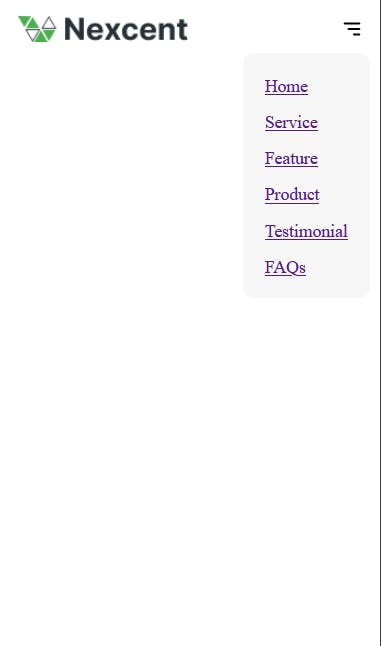
This is our responsive Navbar for small screens with a dropdown containing all the links.
Ignore the styling for links lol 🙄
Congratulations, we've successfully created a Responsive Navbar by using just HTML and CSS! We should understand that using prebuilt components has become a necessity but one should never compromise their basics for it. Best of luck for your further projects, Keep building and follow DevHub for such cool articles.
Join the DevHub community on Discord here


